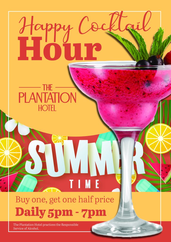
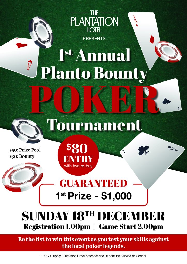
Want to create eye-catching posters that grab attention? This guide covers the basics of poster design and offers tips for making your message stand out.
Posters are a great way to promote events, products, or ideas, but creating an effective poster can be a challenge. To make your poster stand out, you’ll need to consider factors like layout, color, typography, and imagery. In this guide, we’ll cover the basics of poster design and offer tips to help you create eye-catching posters that grab attention.
Determine your message and target audience.
Before you start designing your poster, it’s important to determine your message and target audience. What do you want to communicate? Who do you want to reach? Once you have a clear understanding of your message and audience, you can tailor your design to effectively communicate your message and appeal to your target audience.
For example, if you’re promoting a music festival, your target audience may be young adults who are interested in music, so your design should reflect that demographic.

Choose the right colors and fonts.
When it comes to poster design, choosing the right colors and fonts can make all the difference in grabbing attention and conveying your message. Use colors that are eye-catching and complementary to each other, but avoid using too many colors that can make your poster look cluttered. Similarly, choose fonts that are easy to read and match the tone of your message.
For example, if you’re promoting a serious event, use a more formal font, while a fun and playful event can use a more whimsical font.
Use high-quality images and graphics.
Adding high-quality images and graphics to your poster can make it more visually appealing and help convey your message. Use images that are relevant to your message and of high resolution. Avoid using low-quality or pixelated images as they can make your poster look unprofessional.
If you don’t have access to high-quality images, consider using stock photos or graphics from design websites like Canva or Adobe Spark. Just make sure to check the licensing requirements before using them.


Keep the design simple and easy to read.
When it comes to poster design, less is often more. Avoid cluttering your poster with too much text or too many images. Instead, focus on a few key points and use clear, concise language to convey your message. Choose a font that is easy to read and use a hierarchy of font sizes to emphasize important information.
Make sure there is enough white space on your poster to allow the eye to rest and avoid overwhelming the viewer. Remember, the goal is to make your message stand out, not to overwhelm your audience with information.
Use contrast and hierarchy to emphasize important information.
One of the most important aspects of poster design is using contrast and hierarchy to draw attention to the most important information. This can be achieved through the use of bold fonts, larger font sizes, and contrasting colors. For example, if you want to emphasize a particular statistic or message, use a larger font size and a bold font to make it stand out. Similarly, use contrasting colors to create visual interest and draw the eye to important information. Just be careful not to overdo it – too much contrast can be overwhelming and make your poster difficult to read.
