Have you ever wondered what goes into designing a book? It’s not just about picking a font or a cover image. The book design process is a complex and intricate art form that requires a keen eye for detail and a deep understanding of the author’s vision. From selecting the right layout and typography to choosing the perfect color scheme, every element of book design plays a critical role in delivering a book that captivates readers. In this article, we’re going to take you behind the scenes of the book design process, giving you an exclusive look at how designers bring a book to life. Whether you’re an aspiring author, avid reader, or simply curious about the creative process, this article will provide you with a unique perspective on the art of book design. So, sit back, relax, and get ready to discover the magic that goes into designing a book.
The book design process – an overview
The book design process is a complex art form that requires a lot of planning, creativity, and attention to detail. It’s not just about picking a font or a color scheme; it’s about creating a cohesive look and feel that captures the essence of the book and draws readers in. The book design process can be broken down into several steps, each of which plays a critical role in creating a book that stands out on the shelves.
Steps in the book design process
The first step in the book design process is understanding the author’s vision. The book designer needs to have a deep understanding of the book’s themes, characters, and overall message in order to create a design that accurately reflects the author’s intent. Once the designer has a clear understanding of the book’s vision, they can begin to explore different layouts, typography, and color schemes that will bring the book to life.
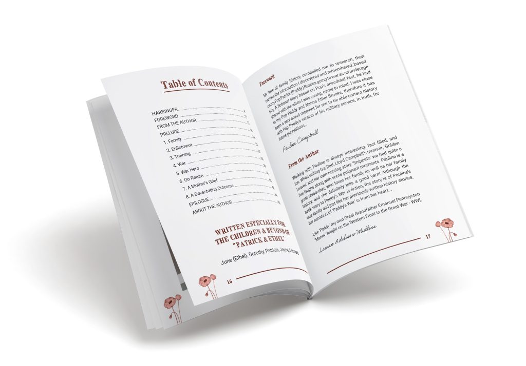
The next step in the book design process is selecting the right layout. The layout of a book plays a critical role in how readers experience the story. The designer needs to consider factors such as readability, flow, and pacing when selecting a layout that will enhance the reader’s experience. The designer may experiment with different layouts, such as single or double-column designs, to find the perfect fit for the book.
Finally, the designer will select the typography and color scheme that best reflects the book’s themes and mood. Typography is a critical component of book design, as it affects readability and can evoke different emotions in readers. The designer may experiment with different fonts, sizes, and styles to find the perfect fit for the book. Similarly, the color scheme of a book can have a significant impact on its mood and tone. The designer will work to create a color scheme that complements the book’s themes and enhances the reader’s experience.
Understanding typography in book design
Typography is a critical component of book design, as it affects readability and can evoke different emotions in readers. The right typography can make a book more readable and engaging, while the wrong typography can make it difficult to read and distract from the story. When selecting typography for a book, the designer needs to consider factors such as font size, style, and spacing.
Font size is one of the most important factors in typography. The designer needs to select a font size that is easy to read, even for readers with poor eyesight. The font size should be consistent throughout the book, with headings and subheadings appropriately sized to help readers navigate the text.
Font style is another important factor in typography. The designer needs to select a font that is consistent with the book’s themes and mood. For example, a horror novel may use a bold, gothic font, while a romance novel may use a more delicate, cursive font. The designer may experiment with different fonts to find the perfect fit for the book.
Spacing is also critical in typography. The designer needs to select a spacing that is easy to read and visually pleasing. Too much spacing can make the text difficult to follow, while too little spacing can make it feel cramped and overwhelming. The designer may experiment with different spacing options to find the perfect balance for the book.
Choosing the right font for your book
Choosing the right font for a book is a critical part of the book design process. The right font can enhance the reader’s experience and make the book more engaging, while the wrong font can distract from the story and make the book difficult to read. When selecting a font, the designer needs to consider factors such as readability, mood, and style.
Readability is the most important factor in font selection. The font needs to be easy to read, even for readers with poor eyesight. The font should be clear and legible, with consistent spacing and letterforms.
Mood is another important factor in font selection. The font should reflect the mood and tone of the book. For example, a horror novel may use a bold, gothic font, while a romance novel may use a more delicate, cursive font.
Style is also critical in font selection. The designer needs to select a font that is consistent with the book’s themes and style. For example, a historical novel may use a serif font, while a modern novel may use a sans-serif font.
Color and imagery in book design
Color and imagery play a critical role in book design. The right color scheme and imagery can enhance the reader’s experience and make the book more engaging, while the wrong color scheme and imagery can distract from the story and make the book less appealing. When selecting a color scheme and imagery, the designer needs to consider factors such as mood, tone, and theme.
The color scheme of a book can have a significant impact on its mood and tone. For example, warm colors such as red and orange can create a sense of excitement and energy, while cool colors such as blue and green can create a sense of calm and relaxation. The designer needs to select a color scheme that complements the book’s themes and enhances the reader’s experience.
Imagery is another critical component of book design. The right imagery can transport readers into the story and make the book more engaging, while the wrong imagery can be distracting and take away from the story. When selecting imagery, the designer needs to consider factors such as relevance, clarity, and aesthetics. The imagery should be relevant to the story and should be clear and visually appealing.
Cover design and its importance
The cover of a book is the first thing readers see, and it plays a critical role in capturing their attention and drawing them in. A well-designed cover can make a book stand out on the shelves and increase its chances of being noticed by readers. When designing a cover, the designer needs to consider factors such as genre, mood, and target audience.
The genre of the book is the most important factor in cover design. The cover needs to accurately reflect the genre of the book and make it clear to readers what they can expect from the story. For example, a horror novel may use dark, ominous imagery, while a romance novel may use soft, romantic imagery.
Mood is another important factor in cover design. The cover needs to reflect the mood and tone of the book, and should be visually appealing to the target audience. For example, a mystery novel may use a dark, moody cover, while a children’s book may use bright, playful colors.
Finally, the designer needs to consider the target audience when designing the cover. The cover needs to appeal to the target audience and make the book stand out on the shelves. For example, a young adult novel may use bold, eye-catching colors and imagery, while an adult novel may use more subtle, sophisticated design elements.
The role of book design in reader engagement
Book design plays a critical role in reader engagement. A well-designed book can transport readers into new worlds and leave them captivated for hours on end. When designing a book, the designer needs to consider factors such as readability, flow, and pacing, in order to create a design that enhances the reader’s experience.
Readability is the most important factor in book design. The text needs to be easy to read and visually appealing, with consistent font sizes, styles, and spacing. The layout of the book needs to be easy to follow, with clear headings and subheadings that help readers navigate the text.
Flow and pacing are also critical in book design. The designer needs to select a layout and typography that enhances the flow of the story and creates a sense of pacing that draws readers in. The designer may experiment with different layouts, such as single or double-column designs, to find the perfect fit for the book.
Tools and software for book design
There are many tools and software programs available for book design. These programs can help designers create professional-quality book designs, with layouts, typography, and color schemes that enhance the reader’s experience. Some of the most popular tools and software programs for book design include Adobe InDesign, QuarkXPress, and Scribus.
Adobe InDesign is a professional-quality layout and design program that is widely used in the book publishing industry. It offers a wide range of layout and typography tools, as well as advanced features such as automation and scripting.
QuarkXPress is another popular layout and design program that is widely used in the book publishing industry. It offers a wide range of layout and typography tools, as well as advanced features such as automation and scripting.
Scribus is a free and open-source layout and design program that is popular among independent authors and publishers. It offers a wide range of layout and typography tools, as well as advanced features such as automation and scripting.
Working with a book design professional
Working with a book design professional can help authors create professional-quality book designs that enhance the reader’s experience. A book design professional can provide expert advice on layout, typography, and color schemes, as well as offer advanced features such as automation and scripting.
When working with a book design professional, it’s important to provide clear guidance on the book’s themes, characters, and overall vision. The designer needs to have a deep understanding of the book in order to create a design that accurately reflects the author’s intent.
Common mistakes to avoid in book design
There are several common mistakes that authors and designers make when designing a book. These mistakes can detract from the reader’s experience and make the book less appealing. Some of the most common mistakes to avoid in book design include:
– Choosing a font that is difficult to read
– Using too many different fonts or font sizes
– Using a color scheme that is distracting or overwhelming
– Using imagery that is irrelevant or unclear
– Using a layout that is difficult to follow or confusing
By avoiding these common mistakes, authors and designers can create professional-quality book designs that enhance the reader’s experience and make the book more appealing.
Conclusion
Book design is a complex and intricate art form that requires a keen eye for detail and a deep understanding of the author’s vision. From selecting the right layout and typography to choosing the perfect color scheme, every element of book design plays a critical role in delivering a book that captivates readers. By understanding the book design process and working with a book design professional, authors can create professional-quality book designs that enhance the reader’s experience and make their stories come to life.
Kuliah Terbaik
Could I include this content in my dataset with your permission? For clarification, this is for my personal hobby as a data scientist, and I’m committed to citing the source in every case. Here my campus page at Kampus Terbaik Thanks! ID : CMT-TPKKENV5IG7SJ8ZAU1
Veeda Catherina
Hey squad, this website feels like a digital playground – maybe add a ‘Pet Parade’ segment for sharing adorable pet photos, pet care tips, and animal stories!
More Information
Asrun Bontito
My two cents: maybe include a section for user-generated content, like creative works from visitors. Would be a great way to foster community engagement!
Visit Here
Felix Meyer
The way you put together the information on your posts is commendable. I would highly recommend this site. You might also want to check my page Webemail24 for some noteworthy inputs about Search Engine Optimization.
Seoranko
You rocked this subject and have astounding insights. I also work hard in putting together great content about Website Design, feel free to visit Seoranko
ArticleHome
Your writing style is cool and I have learned several just right stuff here. I can see how much effort you’ve poured in to come up with such informative posts. If you need more input about Website Traffic, feel free to check out my website at ArticleHome
Autoprofi
Hurray, this is just the right information that I needed. You make me want to learn more! Stop by my page Autoprofi about Car Purchase.
Articlecity
It is always great to come across a page where the admin take an actual effort to generate a really good article. Check out my website Articlecity concerning about Science.
Articleworld
Hurray, this is just the right information that I needed. You make me want to learn more! Stop by my page Articleworld about Data Mining.
Article Sphere
Sharing is caring the say, and you’ve done a fantastic job in sharing your knowledge on your blog. It would be great if you check out my page, too, at Article Sphere about Information Technology.
Article Star
Sharing is caring the say, and you’ve done a fantastic job in sharing your knowledge on your blog. It would be great if you check out my page, too, at Article Star about Blogging.